Distances
For this example notebook, we’ll need to install Ripser.py to create the persistence diagrams:
pip install Cython ripser tadasets
[1]:
import numpy as np
import persim
import tadasets
import ripser
import matplotlib.pyplot as plt
[2]:
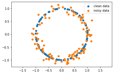
data_clean = tadasets.dsphere(d=1, n=100, noise=0.0)
data_noisy = tadasets.dsphere(d=1, n=100, noise=0.1)
[3]:
plt.scatter(data_clean[:, 0], data_clean[:, 1], label="clean data")
plt.scatter(data_noisy[:, 0], data_noisy[:, 1], label="noisy data")
plt.axis("equal")
plt.legend()
plt.show()
Generate \(H_1\) diagrams for each of the data sets
[4]:
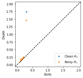
dgm_clean = ripser.ripser(data_clean)["dgms"][1]
dgm_noisy = ripser.ripser(data_noisy)["dgms"][1]
[5]:
persim.plot_diagrams([dgm_clean, dgm_noisy], labels=["Clean $H_1$", "Noisy $H_1$"])
plt.show()
Compute and visualize Bottleneck distance
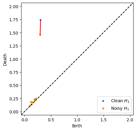
The bottleneck function has the option of returning the matching when the parameter matching is set to True. With the returned data, we can use the plot.bottleneck_matching function to visualize which persistence points contributed to the distance. The bottleneck of the matching is shown as a red line, while the other pairs in the perfect matching which are less than the diagonal are shown as green lines (NOTE: There may be many possible matchings with the minimum bottleneck, and
this returns an arbitrary one)
[6]:
distance_bottleneck, matching = persim.bottleneck(dgm_clean, dgm_noisy, matching=True)
[7]:
persim.bottleneck_matching(
    dgm_clean, dgm_noisy, matching, labels=["Clean $H_1$", "Noisy $H_1$"]
)
plt.show()
The default option of matching=False will return just the distance if that is all you’re interested in.
[8]:
print(distance_bottleneck)
persim.bottleneck(dgm_clean, dgm_noisy)
0.2810312509536743
[8]:
0.2810312509536743
Below is another example
[9]:
dgm1 = np.array([[0.6, 1.05], [0.53, 1], [0.5, 0.51]])
dgm2 = np.array([[0.55, 1.1], [0.8, 0.9]])

d, matching = persim.bottleneck(dgm1, dgm2, matching=True)

persim.bottleneck_matching(dgm1, dgm2, matching, labels=["Clean $H_1$", "Noisy $H_1$"])
plt.title("Distance {:.3f}".format(d))
plt.show()
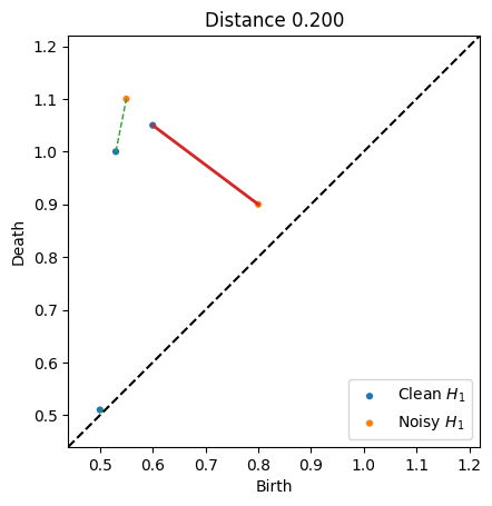
If we print the matching, we see that the diagram 1 point at index 0 gets matched to diagram 2’s point at index 1, and vice versa. The final row with 2, -1 indicates that diagram 1 point at index 2 was matched to the diagonal
[10]:
matching
[10]:
array([[ 0.   ,  1.   ,  0.2  ],
       [ 1.   ,  0.   ,  0.1  ],
       [ 2.   , -1.   ,  0.005]])
Sliced Wasserstein distance
Sliced Wasserstein Kernels for persistence diagrams were introduced by Carriere et al, 2017 and implemented by Alice Patania.
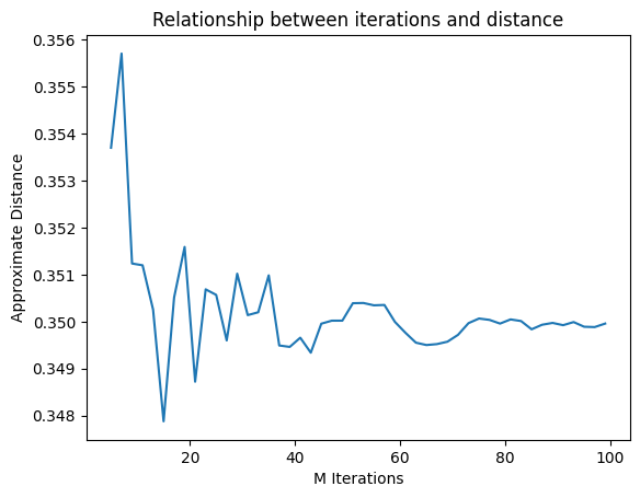
The general idea is to compute an approximation of the Wasserstein distance by computing the distance in 1-dimension repeatedly, and use the results as measure. To do so, the points of each persistence diagram are projected onto M lines that pass through (0,0) and forms an angle theta with the axis x.
[11]:
persim.sliced_wasserstein(dgm_clean, dgm_noisy)
[11]:
0.34984908615137117
The parameter M controls the number of iterations to run
[12]:
Ms = range(5, 100, 2)
ds = [persim.sliced_wasserstein(dgm_clean, dgm_noisy, M=M) for M in Ms]
[13]:
plt.plot(Ms, ds)
plt.xlabel("M Iterations")
plt.ylabel("Approximate Distance")
plt.title("Relationship between iterations and distance")
plt.show()
Heat Kernel Distance
We also implement the heat kernel distance
[14]:
persim.heat(dgm_clean, dgm_noisy)
[14]:
0.07119820450003951
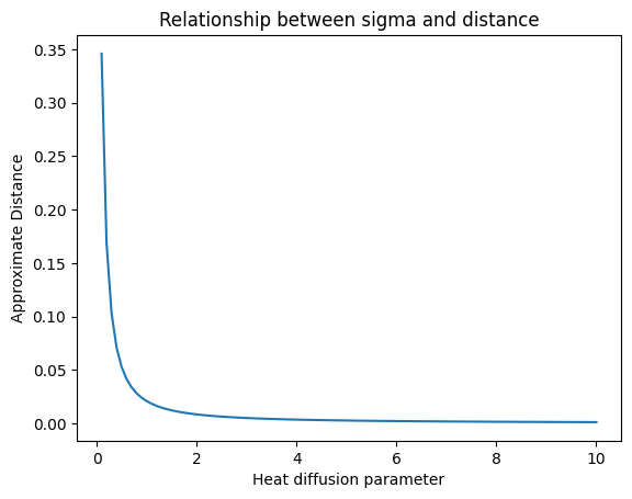
The parameter sigma controls the heat diffusion.
[15]:
sigmas = np.linspace(0.1, 10, 100)
ds = [persim.heat(dgm_clean, dgm_noisy, sigma=s) for s in sigmas]
[16]:
plt.plot(sigmas, ds)
plt.xlabel("Heat diffusion parameter")
plt.ylabel("Approximate Distance")
plt.title("Relationship between sigma and distance")
plt.show()
Various levels of noise
In this example, we will simulate various levels of noise and compute the distances from the clean circle
[17]:
data_clean = tadasets.dsphere(d=1, n=100, noise=0.0)
dgm_clean = ripser.ripser(data_clean)["dgms"][1]
[18]:
dists = []
noise_levels = np.linspace(0.0, 0.9, 30)
samples = 15

dists_bottleneck = []
dists_sliced = []

for n in noise_levels:
    for i in range(samples):
        ds_clean = tadasets.dsphere(d=1, n=100, noise=0.0)
        dgm_clean = ripser.ripser(ds_clean)["dgms"][1]

        ds = tadasets.dsphere(d=1, n=100, noise=n)
        dgm = ripser.ripser(ds)["dgms"][1]

        dists_bottleneck.append((n, persim.bottleneck(dgm_clean, dgm)))
        dists_sliced.append((n, persim.sliced_wasserstein(dgm_clean, dgm)))

dists_sliced = np.array(dists_sliced)
dists_bottleneck = np.array(dists_bottleneck)
[19]:
plt.scatter(
    dists_bottleneck[:, 0], dists_bottleneck[:, 1], label="Bottleneck", alpha=0.3
)
plt.scatter(
    dists_sliced[:, 0], dists_sliced[:, 1], label="Sliced Wasserstein", alpha=0.3
)
plt.legend()
plt.show()
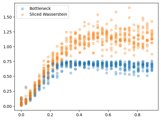
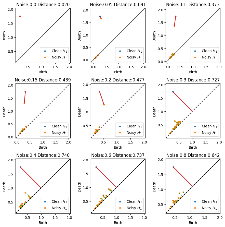
These results are a little strange at first, but remember the raidus for the circle is only 0.5 by default, so a noise level of 0.6 implies the standard deviation of noise is larger than the radius. The grid of plots below shows the resulting matchings. After a certain level of noise, the two objects are not directly matched any more.
[20]:
plt.figure(figsize=(9, 9))
for i, n in enumerate([0.0, 0.05, 0.1, 0.15, 0.2, 0.3, 0.4, 0.6, 0.8]):
    plt.subplot(331 + i)

    ds_clean = tadasets.dsphere(d=1, n=100, noise=0.0)
    dgm_clean = ripser.ripser(ds_clean)["dgms"][1]

    ds = tadasets.dsphere(d=1, n=100, noise=n)
    dgm = ripser.ripser(ds)["dgms"][1]

    d, matching = persim.bottleneck(dgm_clean, dgm, matching=True)

    persim.bottleneck_matching(
        dgm_clean, dgm, matching, labels=["Clean $H_1$", "Noisy $H_1$"]
    )

    plt.title("Noise:{} Distance:{:.3f}".format(n, d))

plt.tight_layout()
plt.show()